Spotify

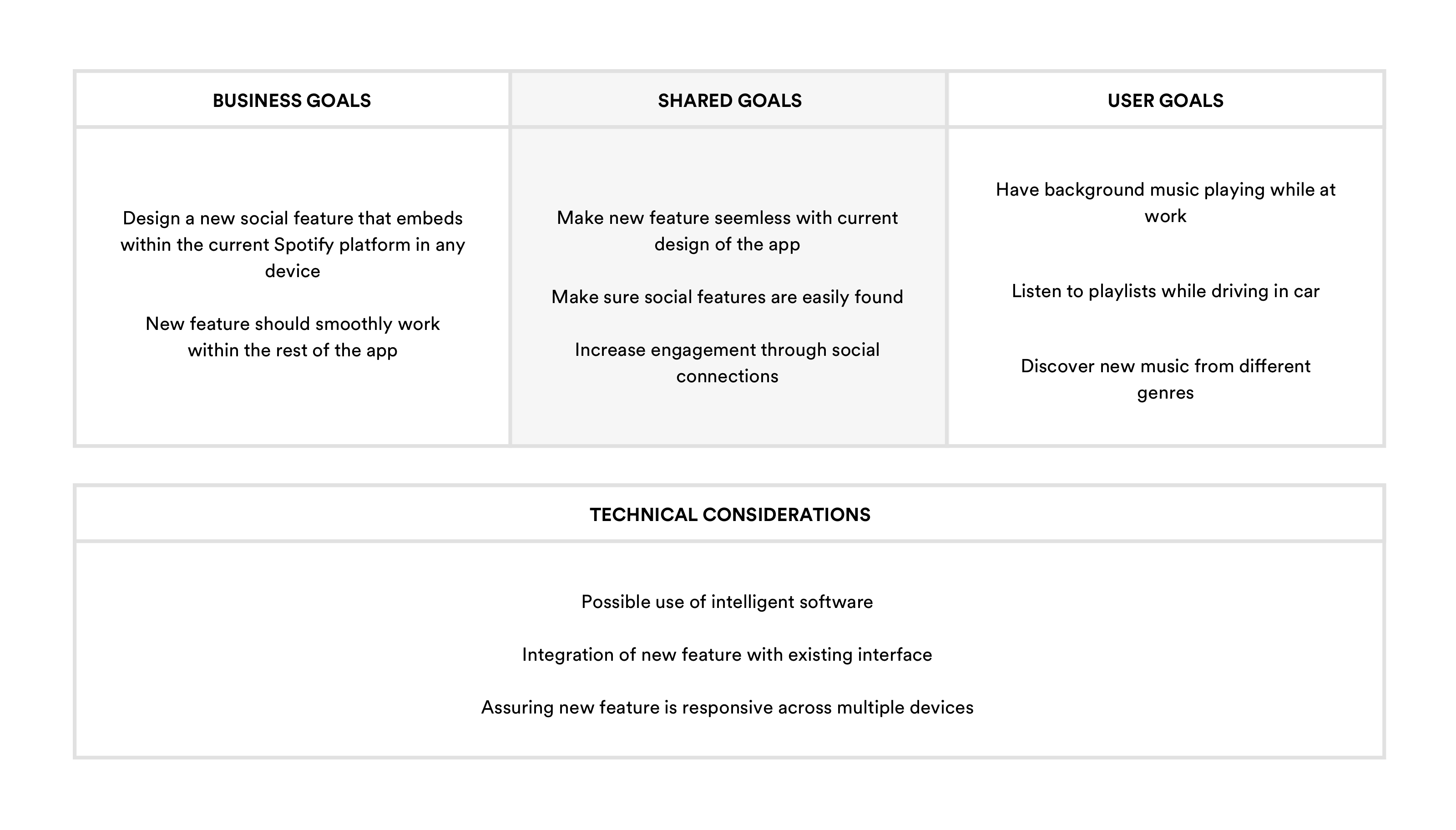
Spotify’s mission is clear: “to help people listen to whatever music they want, whenever they want, wherever they want—in a completely legal and accessible way.” As a streaming music service, Spotify is the group lead and it wants to stay that way. To improve engagement and retention, we look at the social capabilities within the app and how those can be enhanced.

Note: This project was part of a course assignment through Designlab’s UX Academy. All research and design is based on real user interviews as well as feedback from mentors and fellow students. I am in no way affiliated with Redemptive Cycles.

The Details

Client: Spotify

Timeline:
August 1, 2019 - August 13, 2019

Team: Self-directed, mentor and peer feedback

Role: UX/UI Designer

Tools:

Goals & Objectives

• Design a new social feature in the current Spotify mobile app.

• Make sure the new feature integrates smoothly with the rest of the mobile app.

• Follow Spotify's existing design patterns

1 - Research

Goal:
To research the Spotify, the streaming music industry and understand the users the industry.

Process:
Market research, Competitive analysis, Contextual inquiry interviews, and App audit
I began the process with doing some market research to gain a better understanding of the music streaming industry as well as Spotify's user demographics. This was followed by identifying competitors, conducting user interviews and doing an app audit to better understand Spotify and its functionality and flow.

Market Research

The music streaming industry is a beast. There are many players in the industry but Spotify definitely leads the way. The majority of Spotify's users fall within the 25 - 34 year old range followed by a close second with the 18 - 24 year olds. Spotify users have a high daily listening rate with the majority choosing mobile as their preferred device.

Competitive Analysis

Next, I looked into other players in the music streaming industry and compared each one with the other. Choosing a handful of the more popular services, it was interesting to see how they matched up. Spotify's users tend to use the service more within a given month compared the competitors in part because of how user-friendly the interface is.

Contextual Inquiry Interviews

I conducted several user interviews in order to collect information about their overall experience with Spotify. Of the interviewees, 3 were male and 2 were female. All the interviewees fall between the ages of 27 - 42. Through these interviews I was able to learn more about who the users are and the experiences they have using the Spotify.

Number of Participants: 5
Gender: 3 male / 2 female
Age: 27 - 42 years old

App Audit

To familiarize myself with the current design and interface of Spotify, I conducted an app audit. This gave me a better understanding of the main features and social capabilities that are currently offered. I conducted the audit based on Jakob Nielsen's Usability Heuristics.

2 - Define

Goal:
To define the target user and understand their needs, goals and frustrations.

Process:
Empathy map, Persona, POV Statements + HMW Questions
To fully understand who the target user is and cultivate empathy, I first constructed an empathy map based on the interviews performed in the research phase. From here I was able to see the users' needs and most common patterns from these users. This allowed me to create a Persona and begin exploring solutions to those needs.

Empathy Map

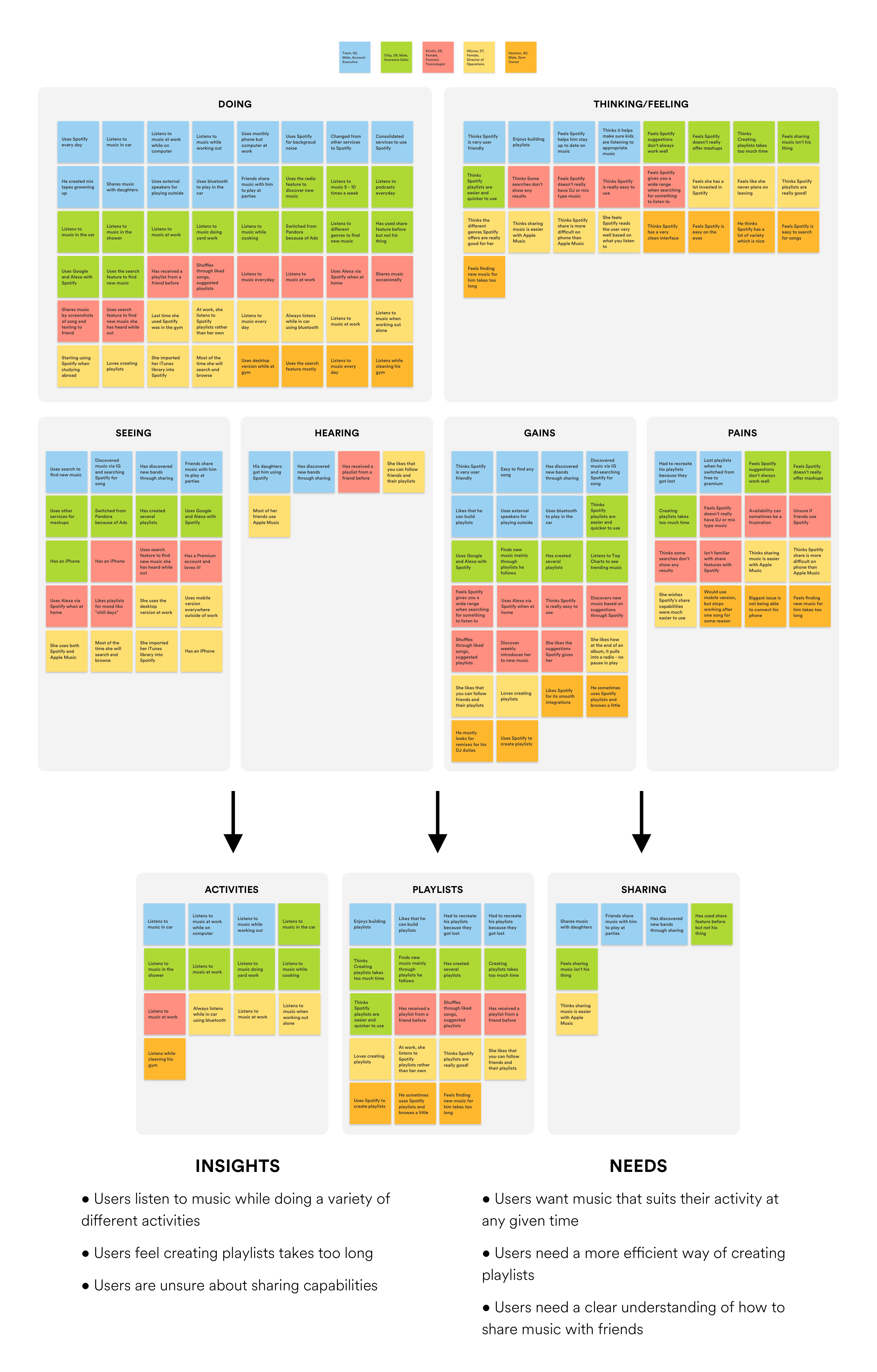
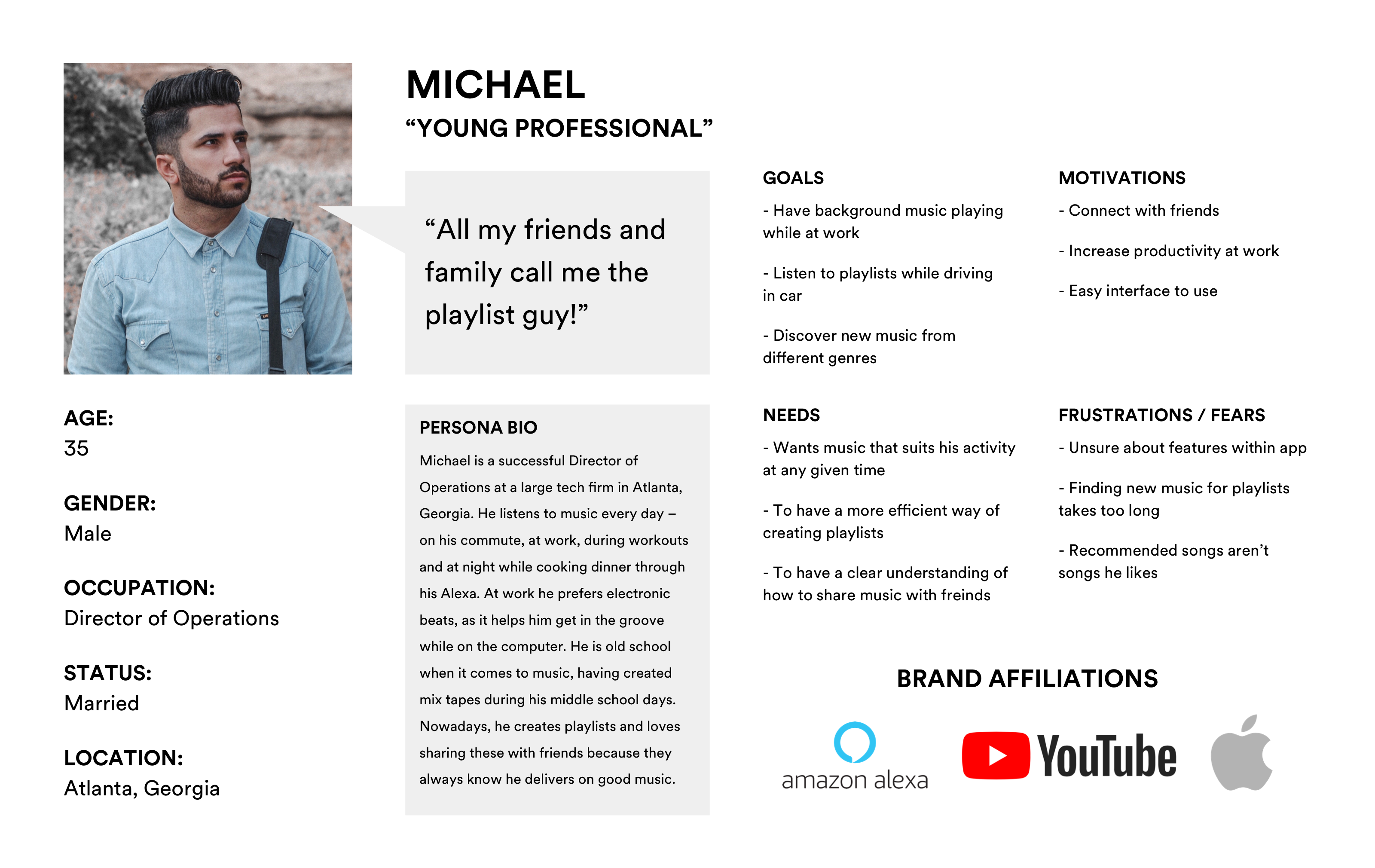
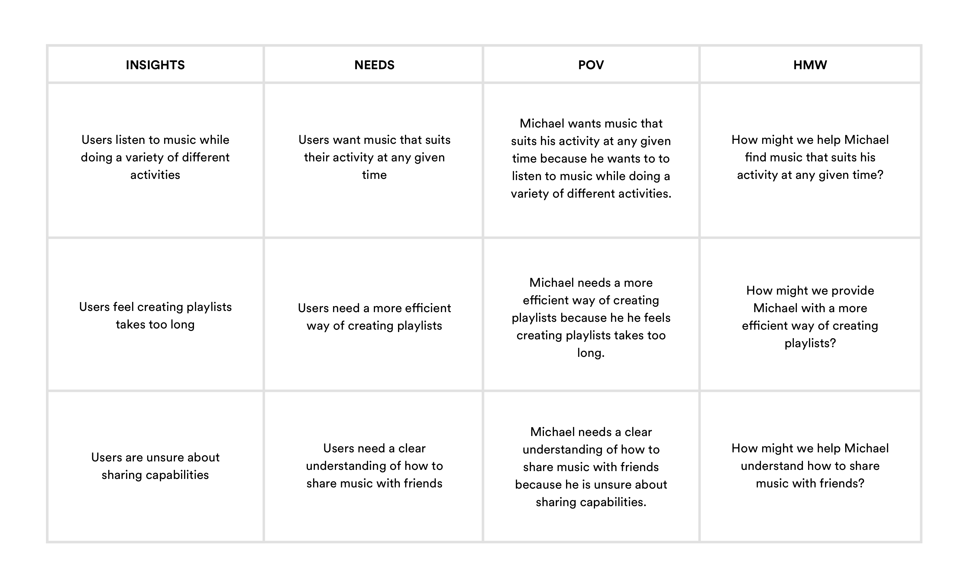
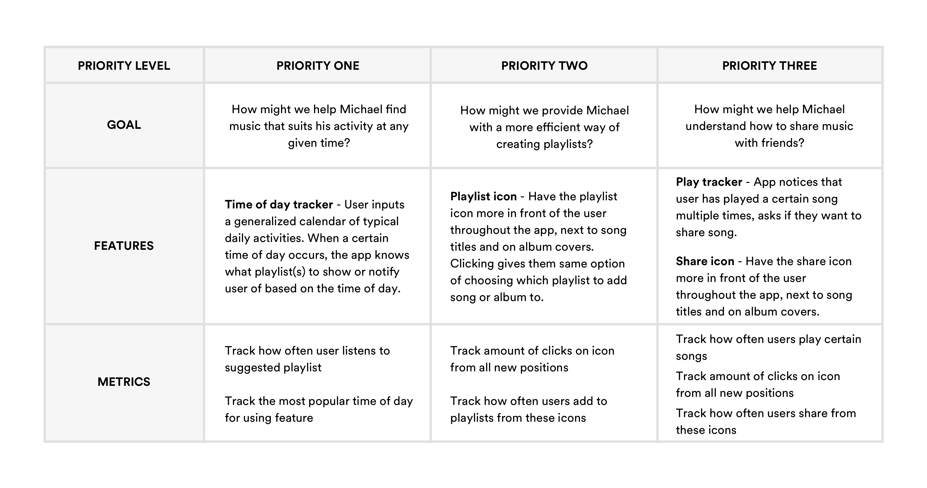
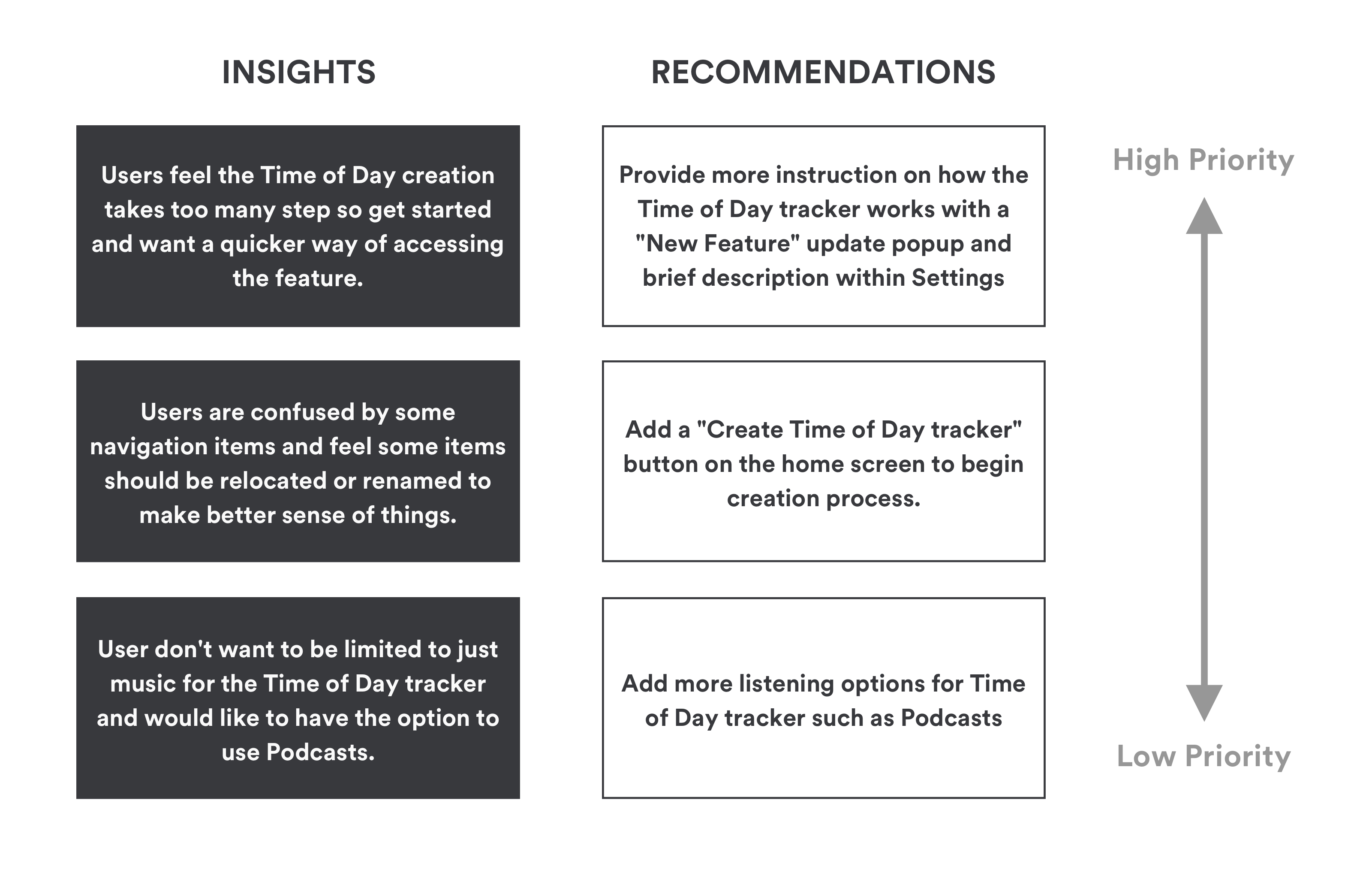
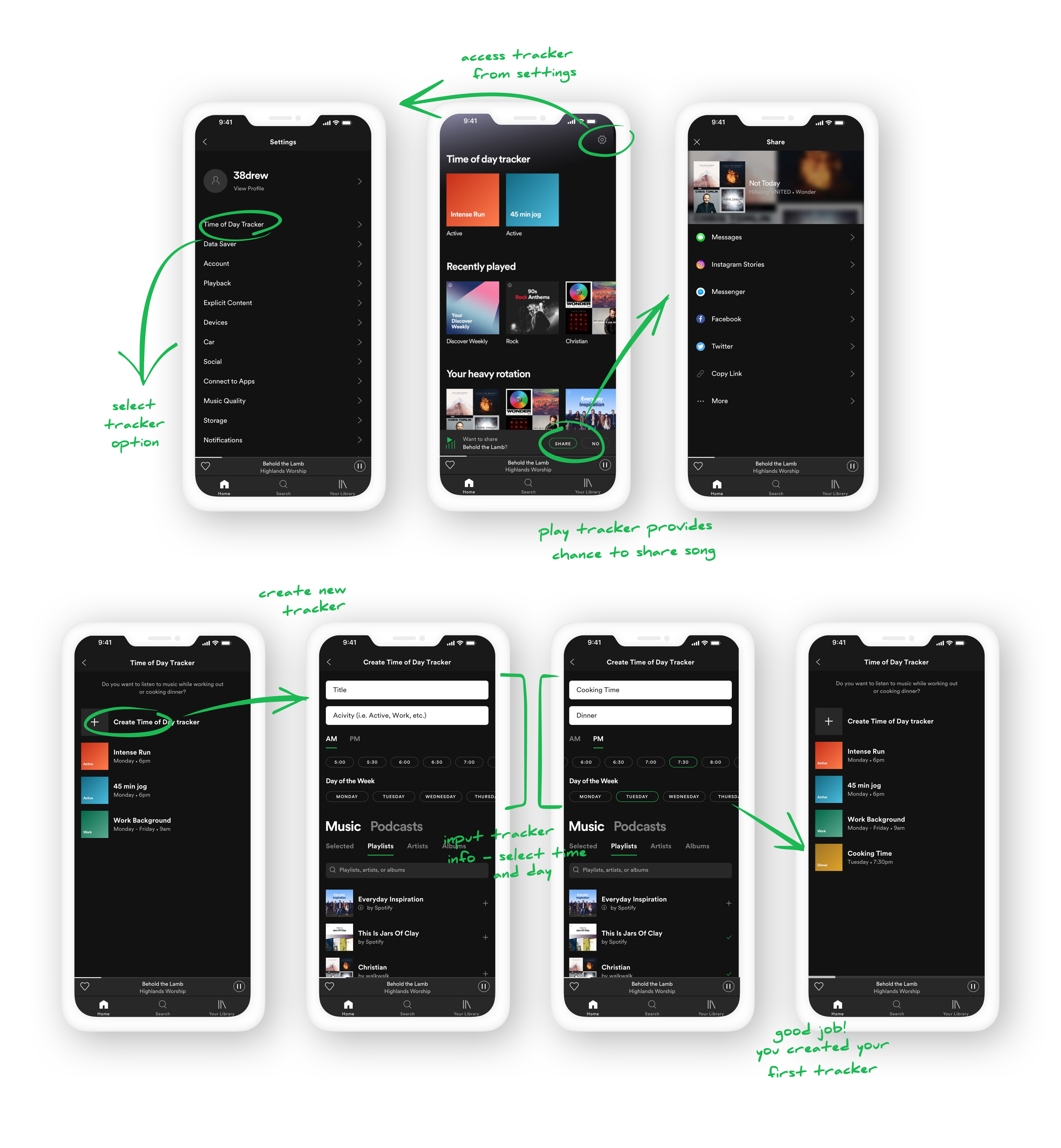
With the main objective of adding social capabilities to the Spotify app, it was important to gain insight into how users currently use that app and to what extent they use it socially. I found that a large portion of those interviewed, either did not share music or did not fully understand the sharing options within the app. By using an empathy map, I was able to identify the user needs and how I might be able to improve social interaction.

Persona

Next, I created a persona "Michael" based on the findings from the empathy map. Michael represents Spotify's target demographic. With Michael, we can better empathize with the target user throughout the design process.

POV Statements + HMW Questions

After defining the target user, Michael, I needed to better understand how I can help Michael with Spotify and its social capabilities. I created point-of-view statements and how-might-we questions to help encourage solutions for those needs.

3 - Ideate

Goal:
To ideate features, information architecture and flows.

Process:
Individual & Group Brainstorming, Business & User Goals, Product Roadmap, Sitemap, Task flow and User flow
Here I explored, through various techniques, potential features keeping both business and user goals in mind through the process. I then followed this up with visually seeing how a user might navigate through the app interacting with these features.

Individual & Group Brainstorming

To start, I referenced the how-might-we questions, and conducted a short, individual brainstorming session to generate possible solutions. I followed this up with a group brainstorming session that included 5 Spotify users to help discover potential solutions to Michael's problems. I presented the group with our persona, Michael, explaining the context and reasoning for the brainstorming session. As a group, we were able to discuss and generate a number of ideas. Pizza and cake were provided!

Business & User Goals

To start, I organized both business and user goals into one document by taking goals from the Persona and business goals from the brief. I then identified shared goals and added some technical considerations as well.

Product Roadmap

After the brainstorming sessions, I was able to gather all the suggested features and create a product roadmap focusing on several of the features presented. I took into consideration feasibility, ease of integration and how many users the new features would affect. I limited some of the goals to just one feature solution as to not introduce too much to existing users.

Sitemap

Next, I created a sitemap in order to visualize the information architecture of the app. This helped me determine the best location for each new feature.

Task Flow

To better understand how users will navigate through the site performing specific tasks, I produced a task flow diagram. This allowed me to think through the user's process and make sure all possible pages are developed to help the user gain the information they need.

User Flow

I also created a user flow diagram. This helped me think through different scenarios while a user explores the site and gets the information they are searching for.

4 - Design

Goal:
To design high-fidelity wireframes using Spotify's design patterns.

Process:
Sketches, Branding and High-Fidelity Wireframes
In order to conceptualize how these new features will fit within Spotify's current design, I began the process with sketching out different ideas. I then proceeded to add more context to these sketches by incorporating Spotify's branding and UI through a high-fidelity wireframe.

Sketches

To begin generating ideas for these new features, I sketched out several low-fidelity wireframes of various sections within the app. Sticking to Spotify's design patterns was a challenge when conceptualizing these new features, but feel the end result was a success. I added annotation so that sections were clearly defined allowing me to gather quick feedback.

5 - Prototype

Goal:
To conduct user testing on Redemptive Cycles' prototype and capture usability feedback.

Process:
Mid-fidelity prototype and Usability testing
During the prototyping phase, I applied the elements from the logo and branding assets to the mid-fidelity wireframes in InVision App to create a high-fidelity prototype. This is the prototype I had participants test, going through a few different user tasks.

Usability Testing

I conducted 5 in-person interviews and had each participant perform certain tasks. I was able to collect valuable usability feedback from each participant.

Participants: 5
Gender: 2 male / 3 female
Age Range: 38 - 48
Method: All in-person
Completion Rate: 80%
Error-Free Rate: 80%

6 - Iterate

Goal:
To iterate upon the design and develop high-fidelity wireframes.

Process:
Affinity map, Branding, High-fidelity wireframes & prototype and UI kit
Taking the results and findings from the affinity map, I was able to come up with a few recommendations for improvement on the website. I applied these recommendations and further developed the prototype as well as the branding assets/UI kit.

Affinity Map

After conducting the usability testing, I was able to identify key insights and generate the top recommendations from test users through an affinity map. Taking these recommendations, I now had areas of the site I could improve upon, making for a better user experience.

Branding

Before moving into the high-fidelity wireframes, I researched Spotify's brand guidelines to fully understood the constraints. To help with this process, I created a mood board and studied various sites and articles regarding the Spotify brand.

High-Fidelity Wireframes + Prototype

Finally, I applied the branding and styling to the wireframes in Sketch and made an updated prototype using InVision. The new prototype shows the updated look and feel.

UI Kit

Once I began prototyping, I maintained a UI kit throughout the process to document UI elements and patterns for future reference. I recreated all Shopify elements using Illustrator and Sketch for use in my high-fidelity wireframes.

Wrapup

Overall, I felt I learned a good bit about both the cycling industry and how that industry plays a role in the local market. I believe I was able to get a better understanding of how to interact with users by conducting interviews and improving on an existing brand, yet maintaining that brands core standards.

Next Steps

• Continue organizing and improving the design deliverables

• Continue gaining feedback from users

• Work with developers to implement the design and features of the new website