Mirror
Mirror is a global clothing chain with over 400 locations around the world in 32 countries. They came to us with the task of rebranding to a more modern feel and taking their product online with a responsive e-commerce website.

Mirror is a global clothing chain with over 400 locations around the world in 32 countries. They came to us with the task of rebranding to a more modern feel and taking their product online with a responsive e-commerce website.

With market research, I was able to get a better understanding of the online shopping industry. This includes demographics, trends and pain points.

With the online clothing industry being such a large market, it is critical to understand both direct and indirect competitors. This will help Mirror set themselves apart from their competition.

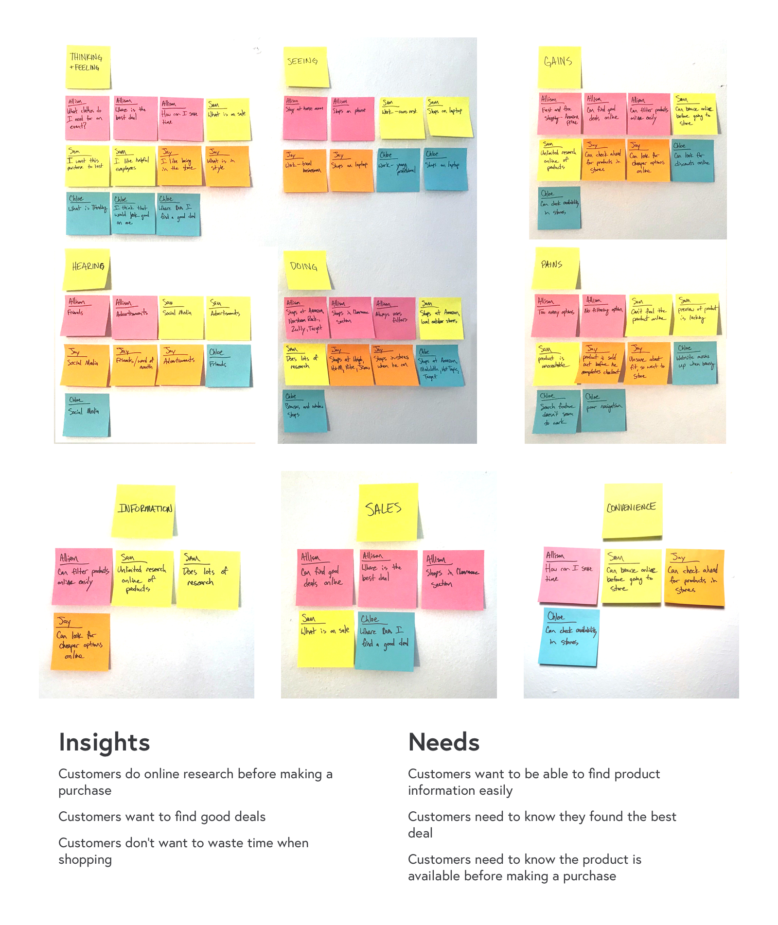
After conducting interviews, I was able to take those findings and organize them with an empathy map. This allowed me to clearly see user needs and common patterns.
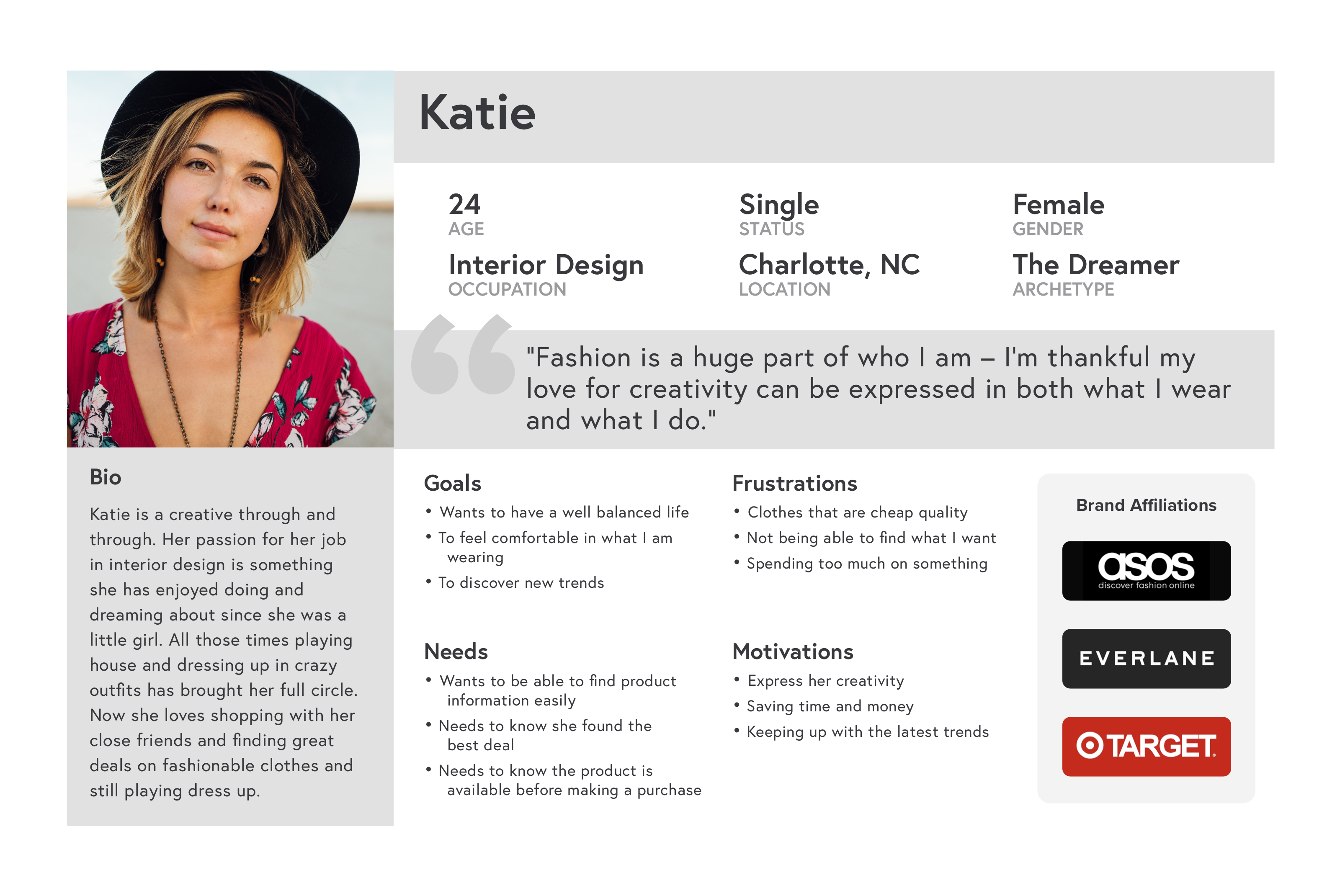
Once I organized the data using an empathy map, I was able to create a persona. This persona reflects the target user for Mirror. With "Katie", we can better empathize with the target user throughout the design process
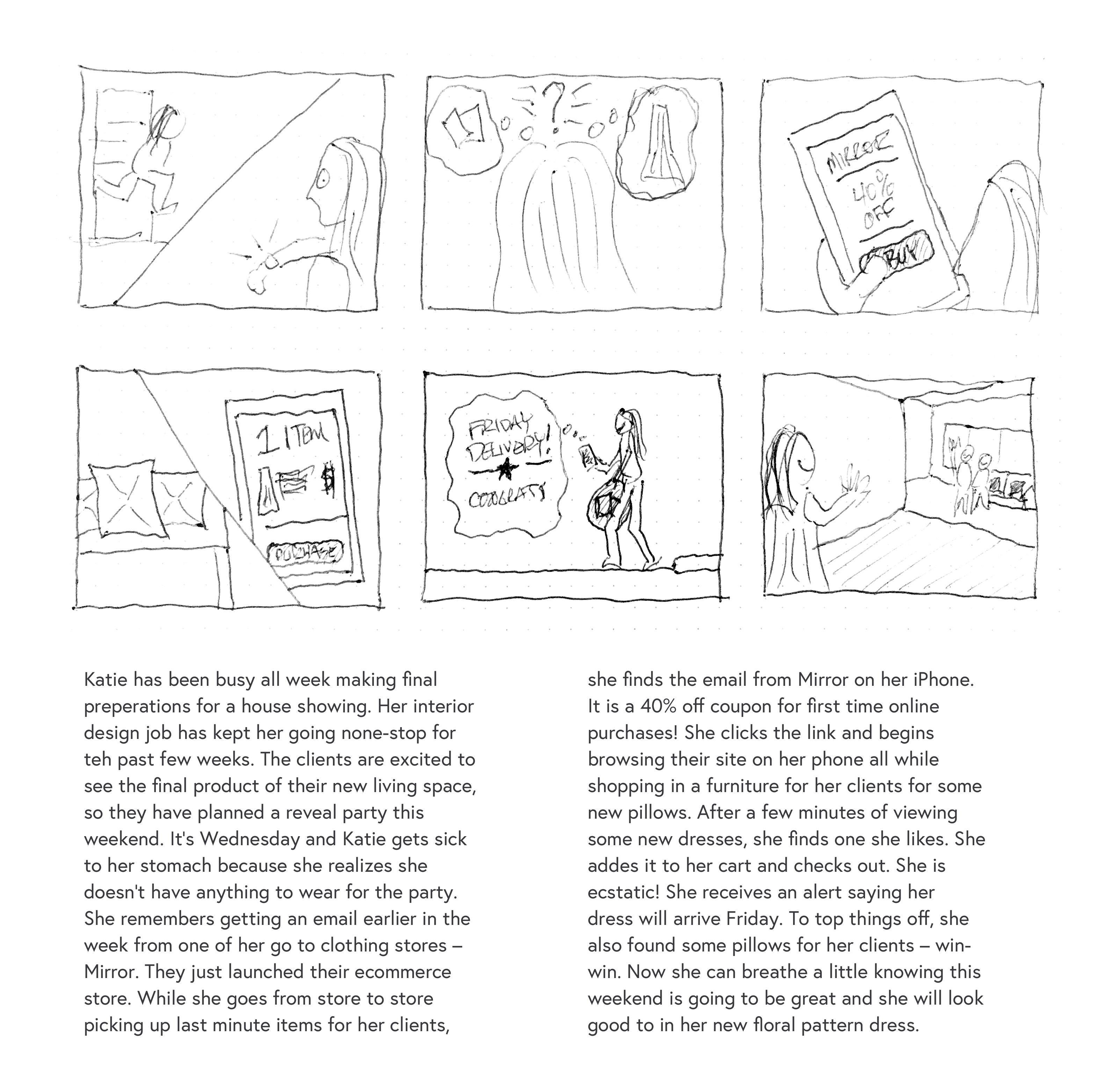
Storyboards are a great tool to quickly illustrate the persona's online shopping experience. This helps us further understand the user, the user's pain points and how Mirror can help provide a solution.
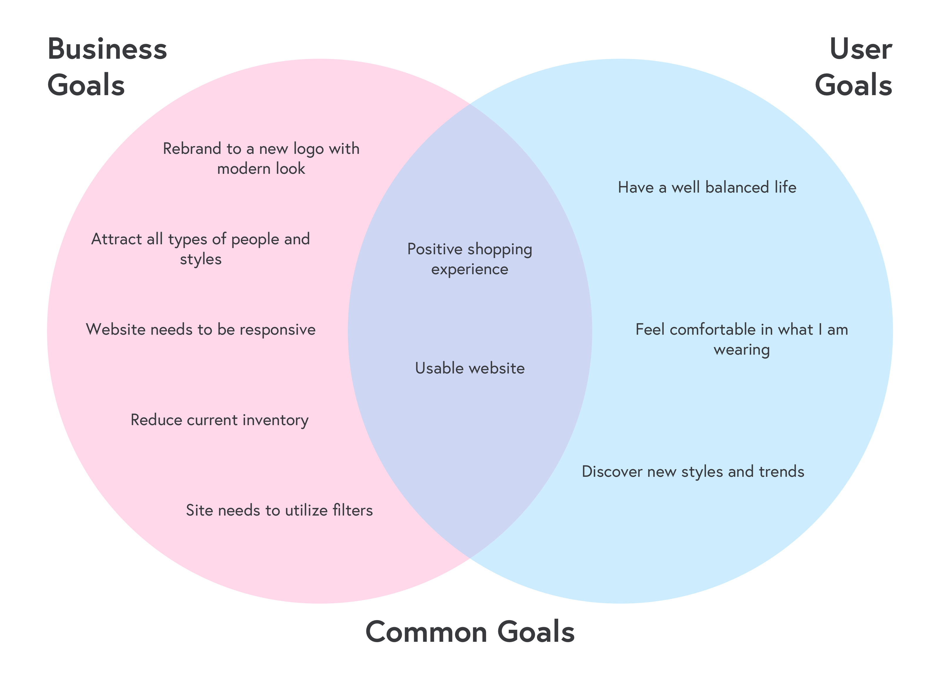
From here, it's good to take a step back and combine the business goals with the user goals to form a project goals diagram. This allows us to have clarity and align all parties involved before making feature decisions.
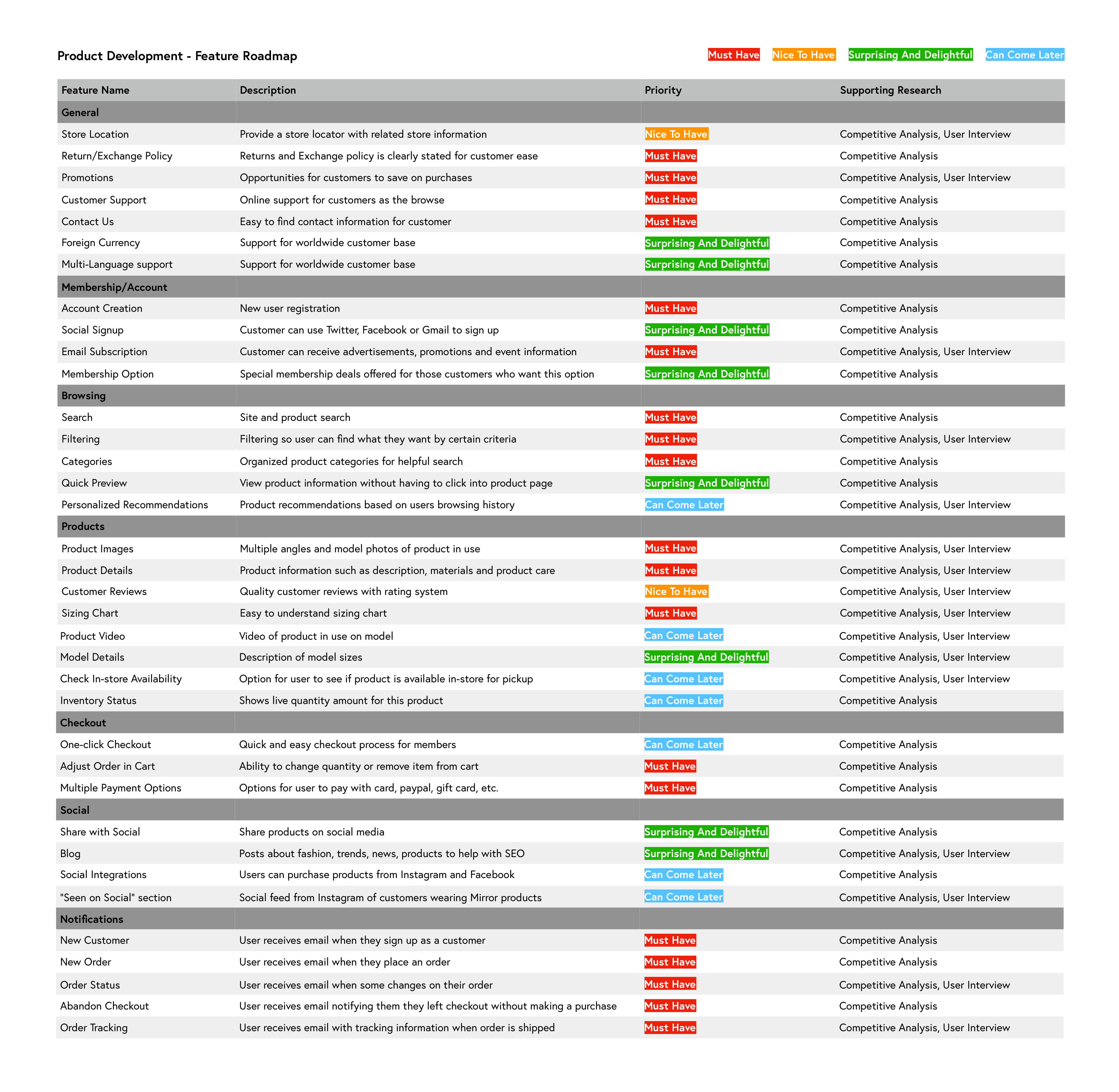
Next we complement the project goals with a feature roadmap, a list of features based on our user research each given a priority level.
I conducted an open card sorting exercise with 3 participants, 2 female and 1 male. There were a total of 49 cards of common clothing and e-commerce terms. Each participant was given as much time as they needed to perform the exercise.

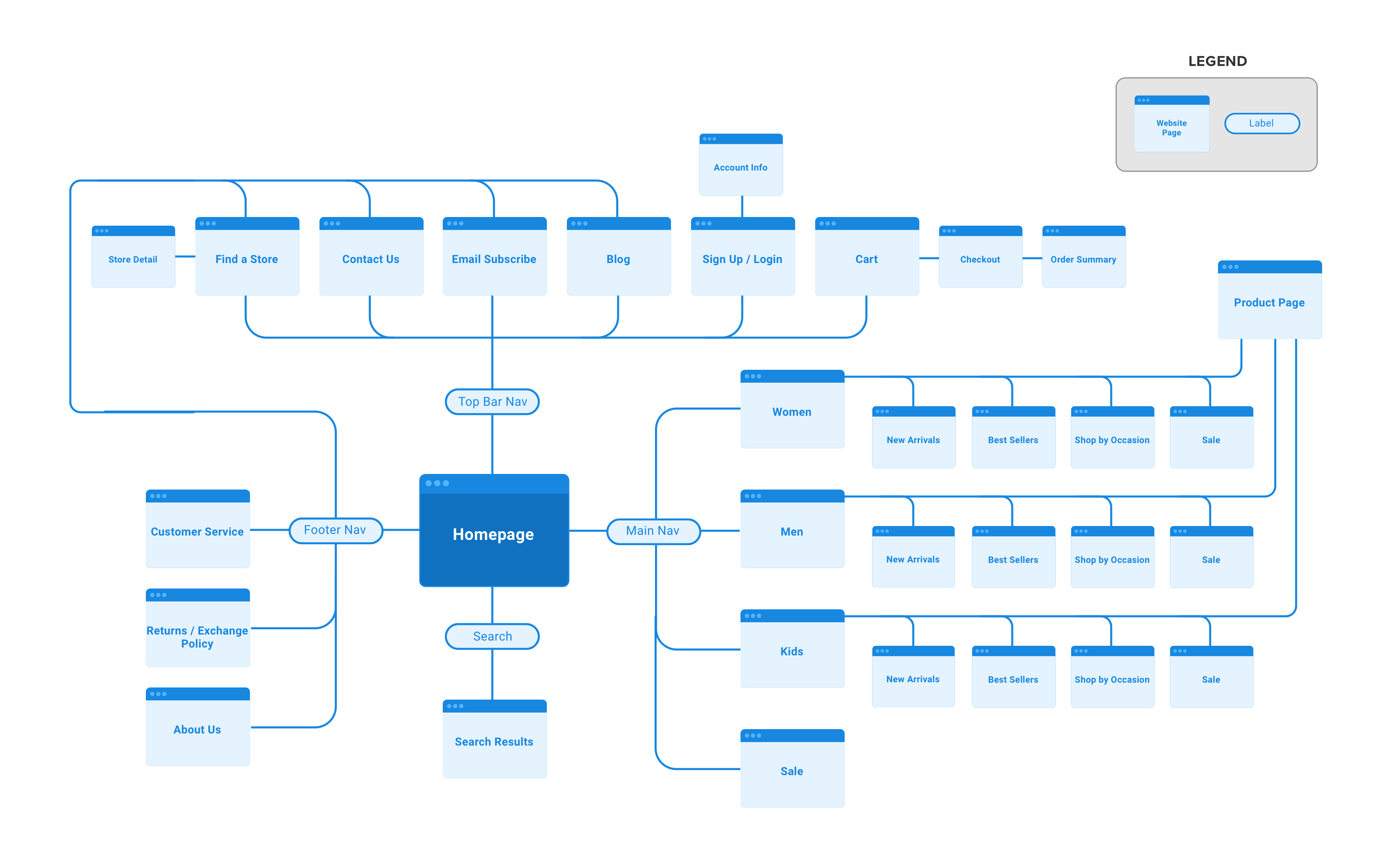
I created a sitemap based on two things - existing e-commerce websites and findings from my card sort exercise with participants. This gives us a clear understanding of sections of the website and how they relate to each other.
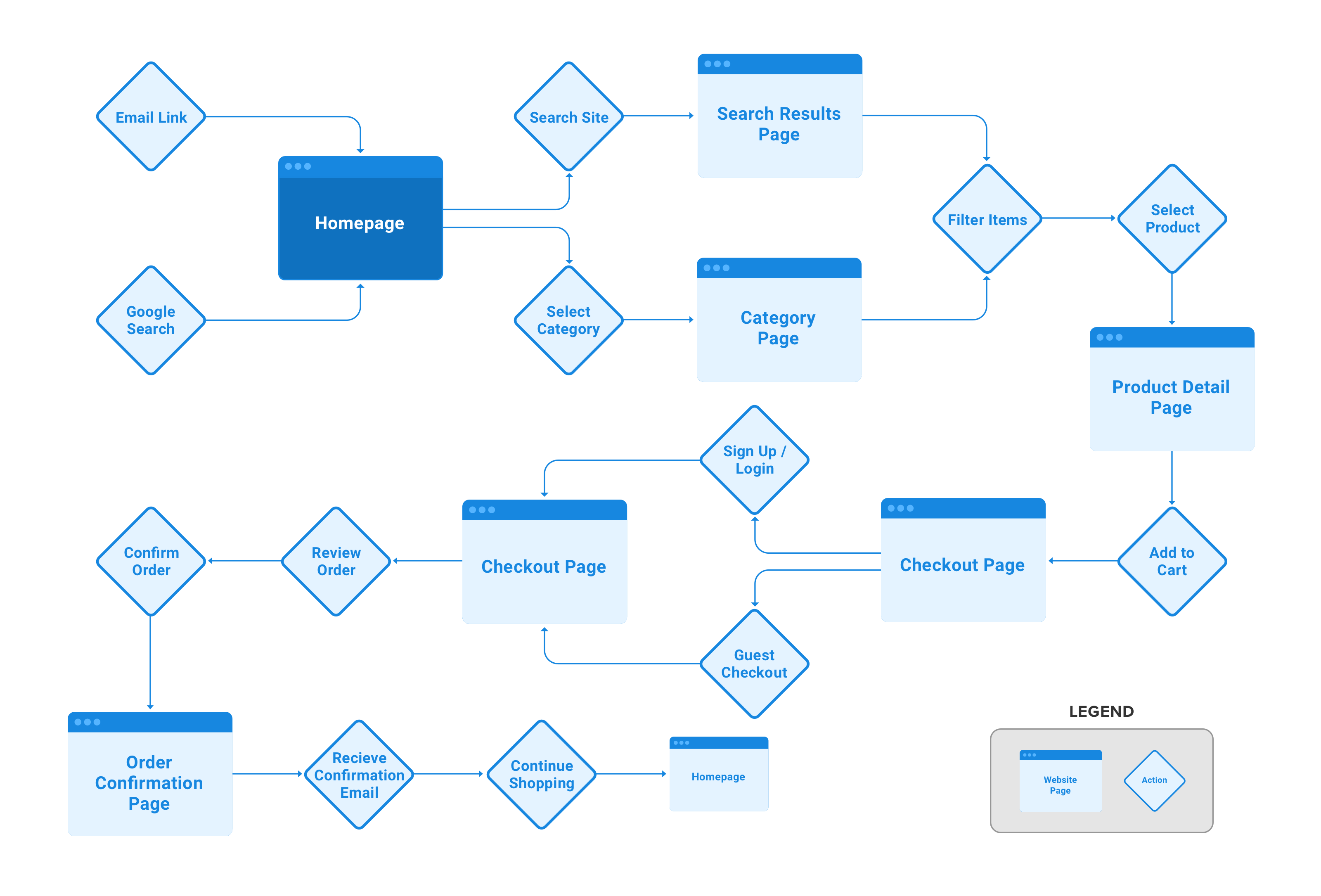
To better understand how users will navigate through the site to make a purchase, I produced a task flow. This allows us to think through different scenarios and make sure all possible pages are developed to help the user complete a purchase.
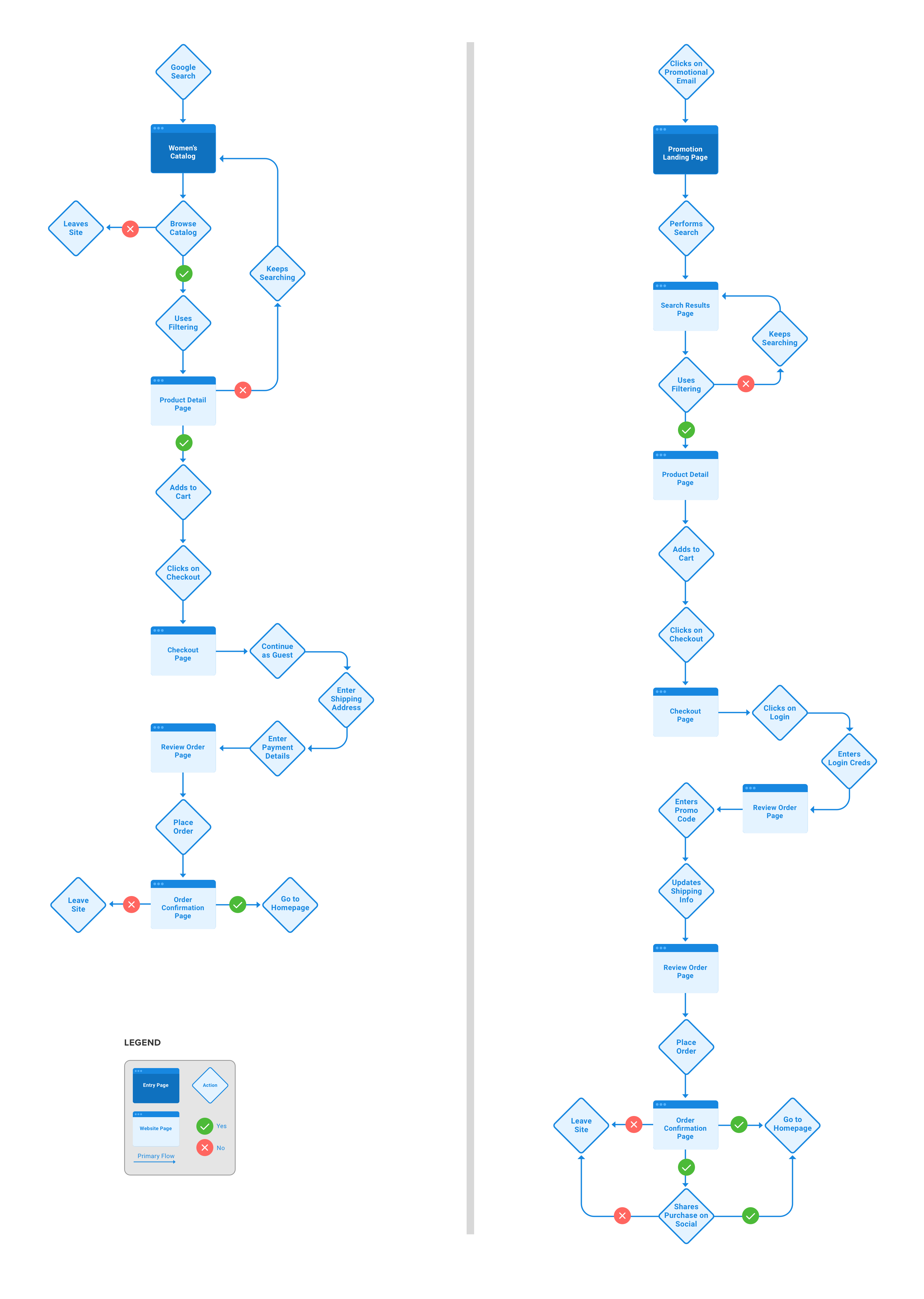
I also created to user flows. These allow us to think through different scenarios while a user explores and ultimately completes the check out process on Mirror's website.
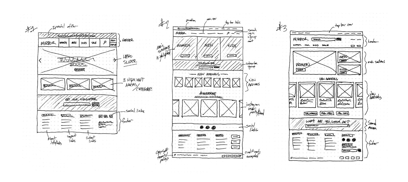
To begin generating ideas for layout of the website, I sketched out several low-fidelity wireframes focusing on the home page design. I added annotation so that sections were clearly defined allowing me to gather quick feedback from testers and peers.
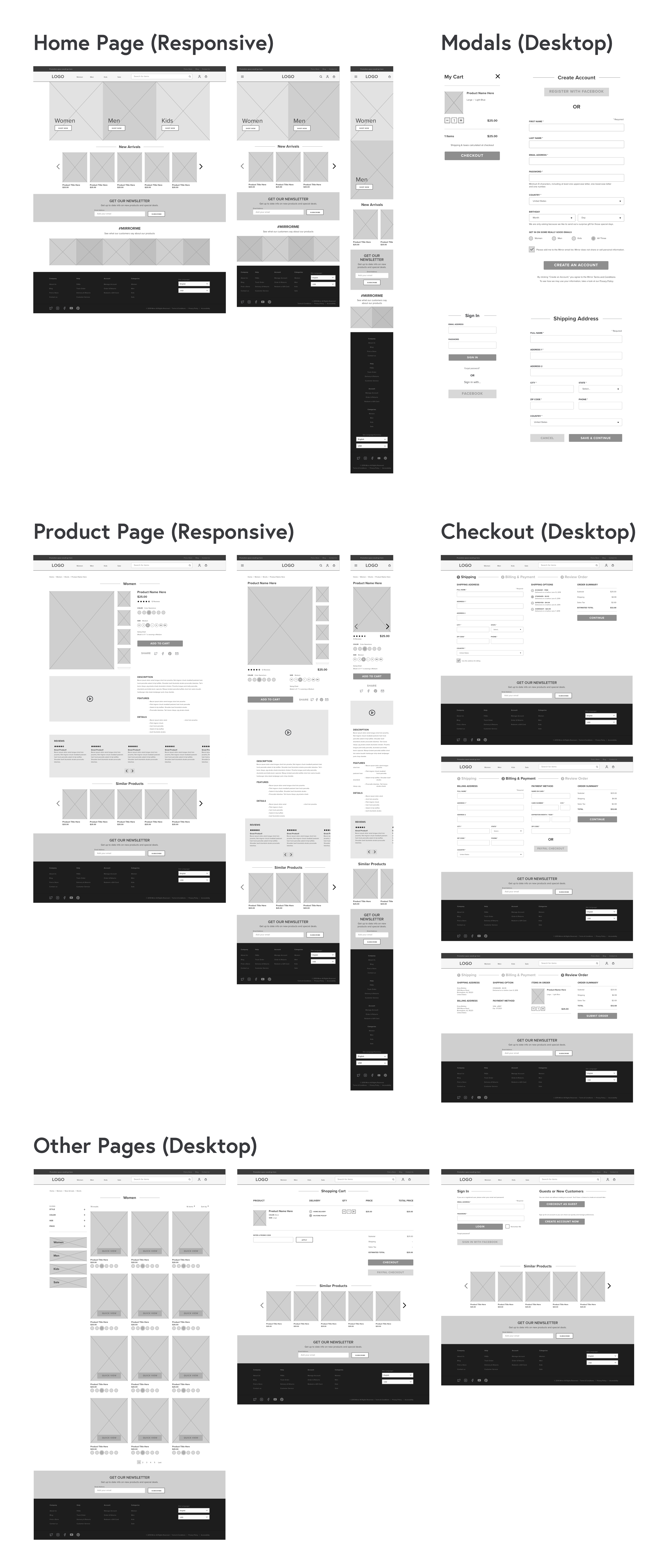
I took my low-fidelity sketches and reproduced the chosen layout in Sketch to create a mid-fidelity wireframe. Going through this process helps me think about overall hierarchy and visual layout of the website.
To wrap up the design phase, I focused on the logo and branding for Mirror. To help with this process, I created a mood board using Pinterest and chose some adjectives to help define Mirror's brand.

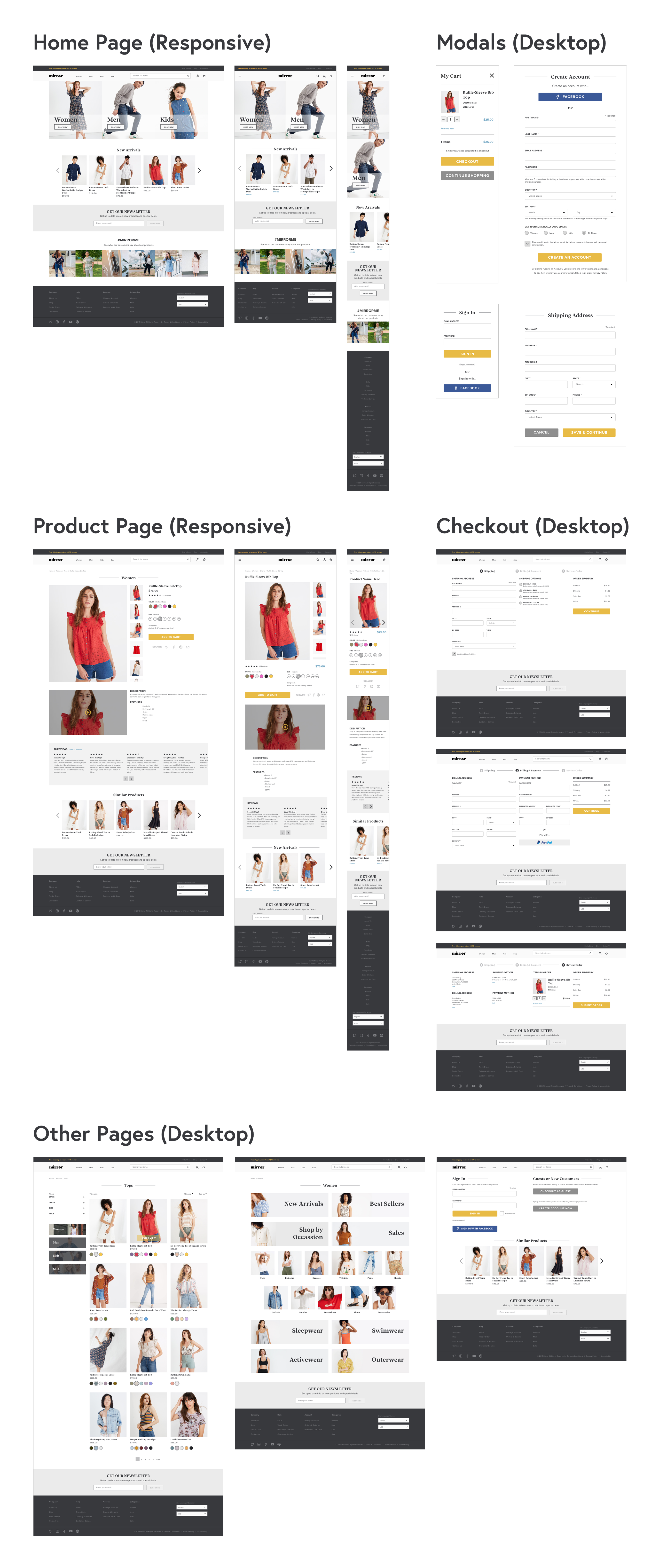
Next step was to take my mid-fidelity wireframe and combine those with the logo and branding assets. Once I had this completed in Sketch, I created the high-fidelity wireframe using InVision. Now I am ready for more user testing.
I conducted 6 in-person interviews and had each participant perform certain tasks. I was able to collect valuable feedback from each participant helping me further develop the high-fidelity prototype.

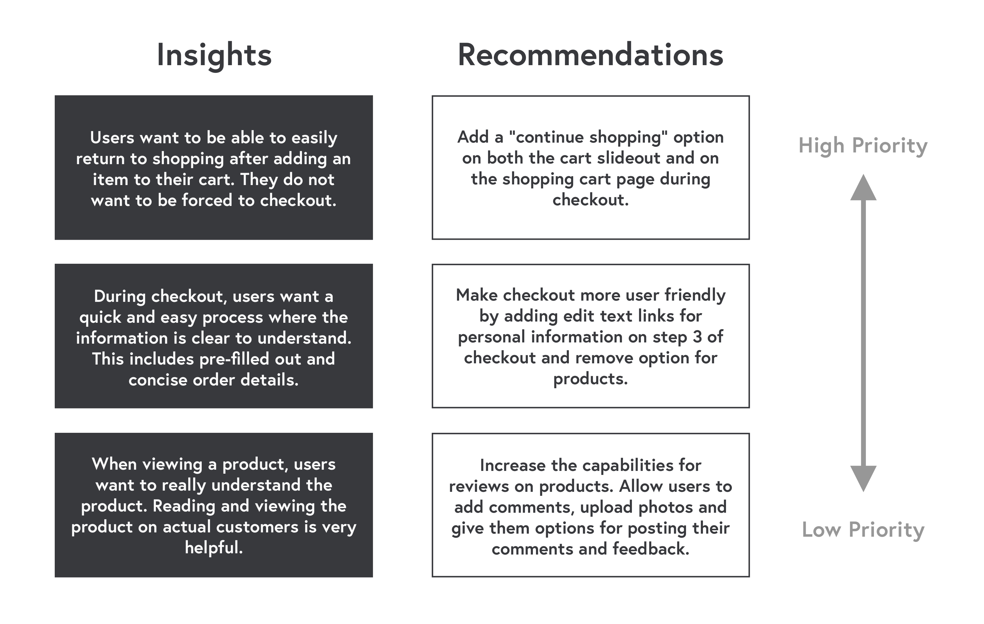
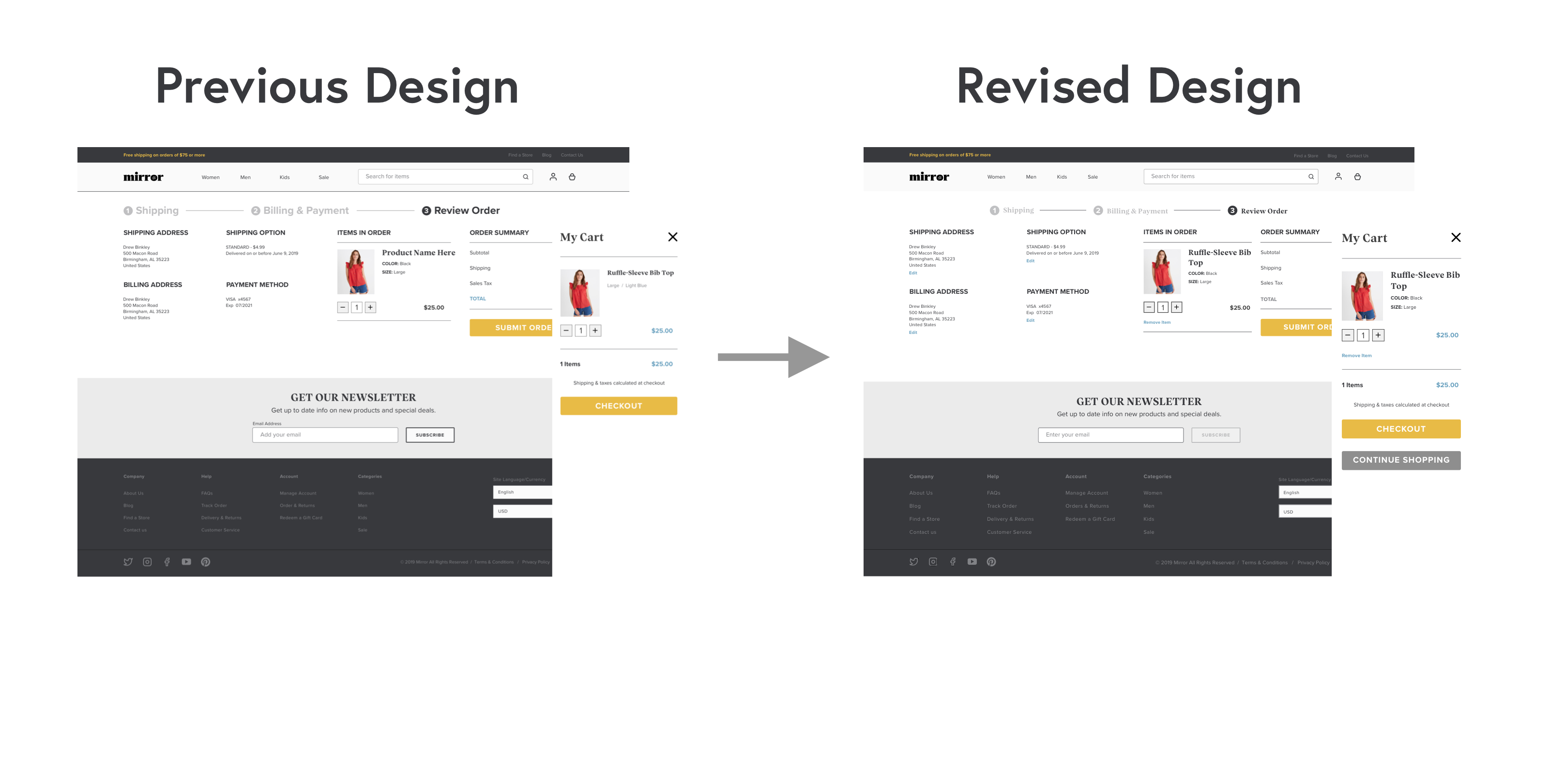
After conducting the usability testing, I was able to take my notes and findings and create an affinity map. Based on these findings, I was able to identify key insights and generate the top recommendations from test users. Taking these recommendations, I now had areas of the site I could improve upon, making for a better user experience.
Next, I applied the recommendations from the test users that I discovered from my affinity map to my high-fidelity prototype and made some other adjustments to further the product.
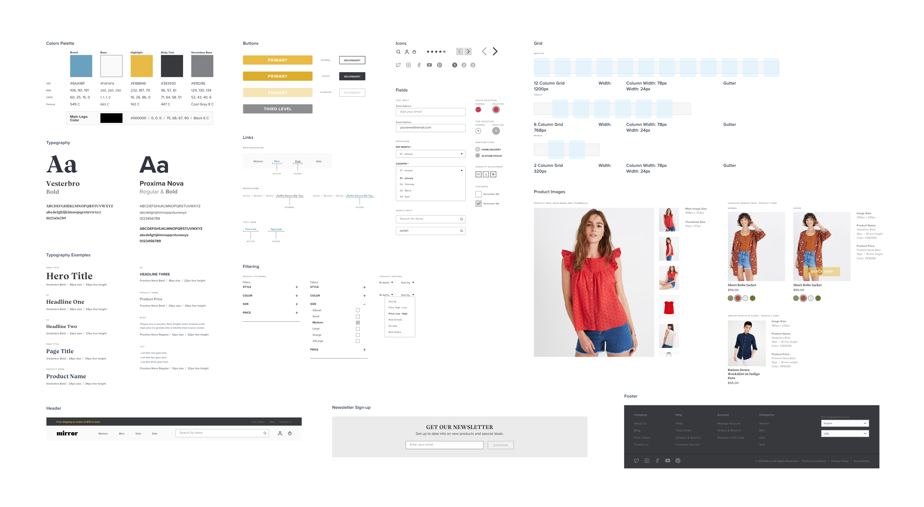
Once I began the logo, branding and prototyping, I also generated and maintained a UI kit throughout the process. This document keeps all of the UI elements and patterns in one place for easy reference. I also prepared handoff deliverables using Zeplin so that developers involved with the project would have a good reference to styles.