HappyDoc

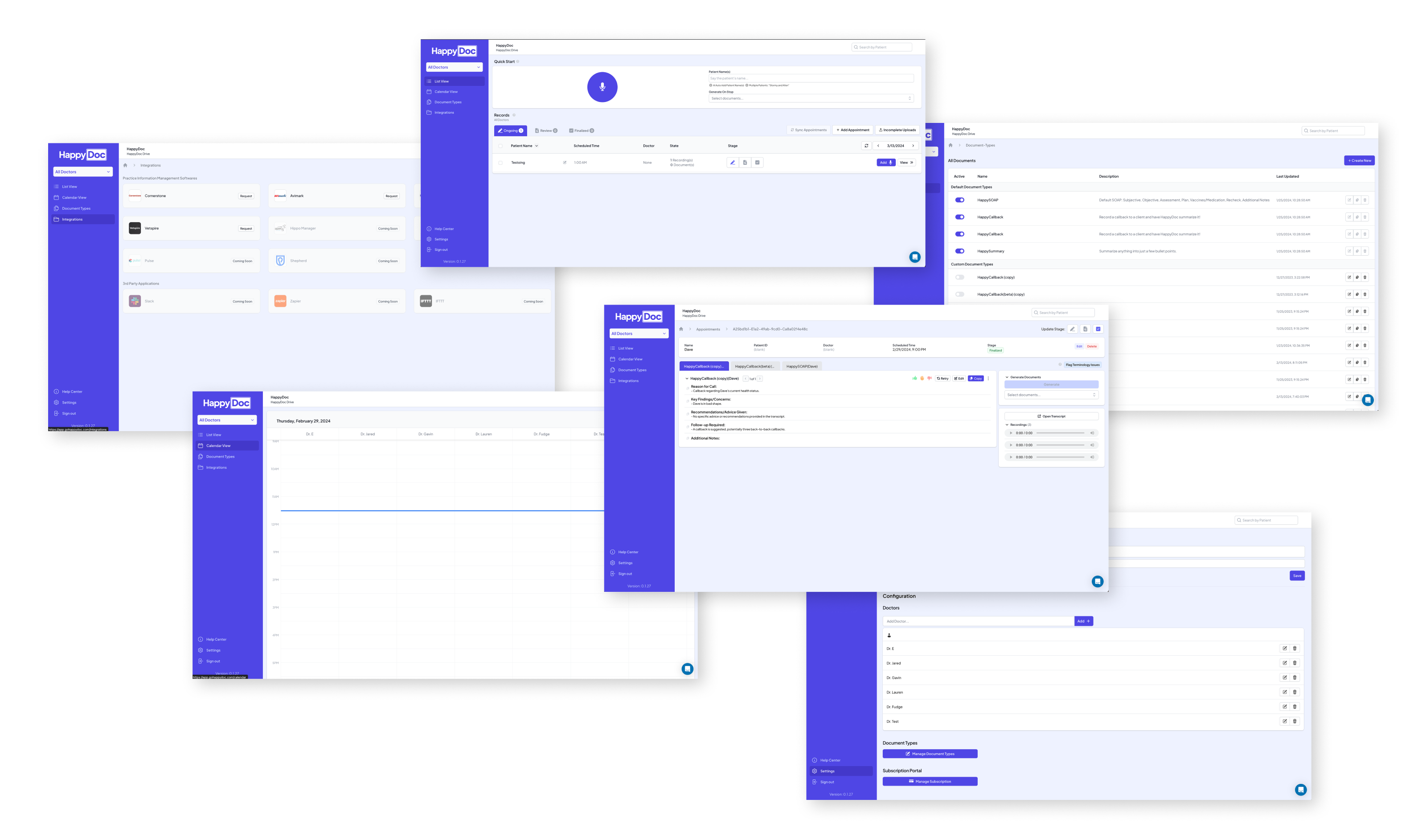
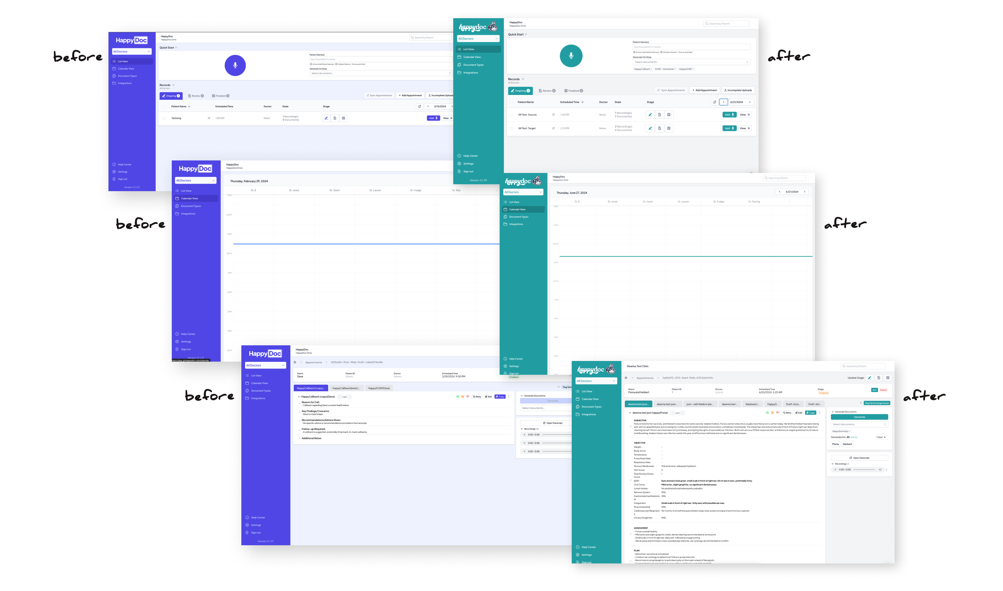
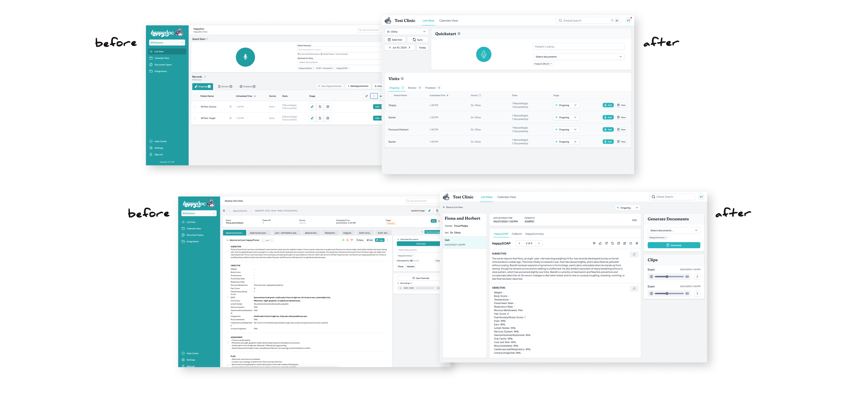
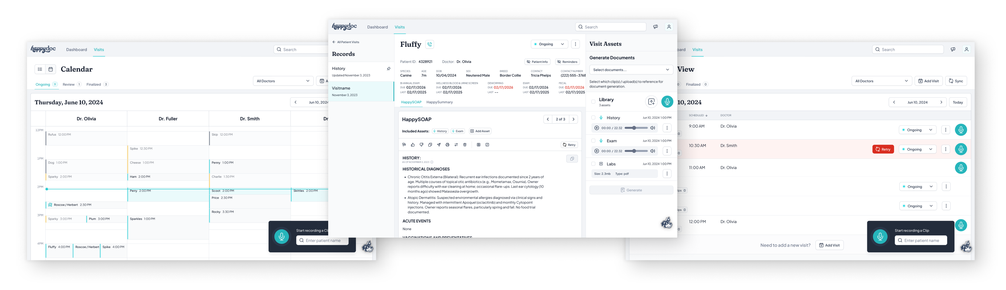
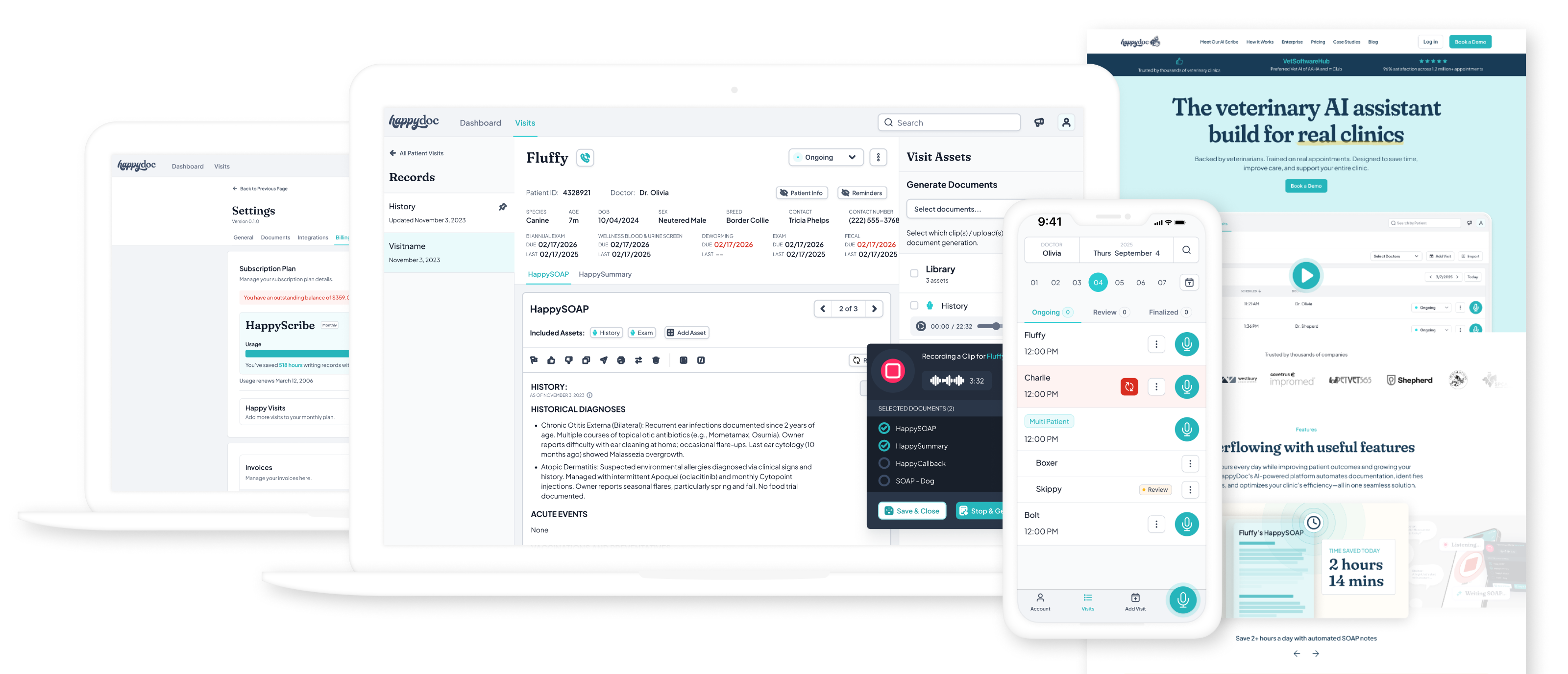
When I joined HappyDoc, the product existed — but the design didn't. Two developers had built a functional AI scribe for veterinary clinics, shipping features quickly and iterating fast. What they hadn't built was a brand, a visual language, or a design process of any kind. Every screen reflected a different set of decisions made in isolation, and there was no system to hold it all together.

I was hired as the company's first designer. In my first year, I built HappyDoc's entire design foundation from scratch — alone.

Senior Product Designer
March 2024 - Present
The Product
AI scribe & assistant for veterinary clinics — automated SOAP notes, PIMS integration, and practice insights.
My Scope
Brand identity, design system, SaaS product redesign, mobile app, and marketing website.
Team Structure
Solo designer, embedded with product & engineering. No design team, no design manager.
Stage
Early-stage startup, high growth, fast-moving sprint cadence with shifting priorities.

The Challenge

Design a coherent brand and product experience for a fast-growing startup — starting with no visual identity, no design system, no tooling, and no precedent. Everything needed to be created, decided, and shipped by one person, without slowing down an engineering team that was already in motion.

The Solution

• A complete brand identity — logo, mark, color system, and typography — built from the ground up.
• A scalable design system and component library used across web and mobile.
• A full redesign of the SaaS product and mobile app, replacing developer-built UI with a consistent, branded experience.
• The marketing website at happydoc.ai, translating the new brand into a public-facing product.
• Marketing creative assets aligned to the new brand for campaigns and outreach.
Discovery & design audit

Understanding the product, the users, and the gaps

There was no onboarding doc, no design brief, and no prior designer to hand things off. Getting up to speed meant doing it myself — talking to the people who built the product, auditing what already existed, and researching the landscape I was stepping into.

Given the pace of a fast-moving startup, this wasn't a formal research phase with defined sprints and deliverables. It was scrappy, ongoing, and woven into the early weeks of the job. But the insights it produced were the foundation everything else was built on.
UI Audit
Internal Interviews
Competitive Research
Clinic Feedback
01

UI Audit

A hands-on review of every screen in the existing product — documenting inconsistencies, accessibility issues, broken patterns, and areas of user friction left behind by developer-driven decisions.
02

Internal Interviews

Conversations with founders, engineers, and the broader team to understand the product vision, technical constraints, and what they believed was and wasn't working from a user perspective.
03

Competitive Research

A self-directed audit of competing vet AI scribes and adjacent medical SaaS products — examining visual positioning, UX patterns, and where HappyDoc had an opportunity to differentiate.
04

Clinic Feedback

Throughout the design process, we periodically engaged with real veterinary clinics to gather feedback on features and new work — keeping actual users in the loop rather than designing in a vacuum.

What The Audit Revealed

No consistent visual language — colors, type, spacing, and component styles varied screen to screen.
UI patterns built for speed of development, not ease of use — creating friction for vets in fast-paced clinical environments.
No brand presence whatsoever — the product looked like a prototype, not a product people would trust with their practice.
A real opportunity: the core functionality was strong. The product just needed a design layer worthy of what it could do.
Click to view details
Brand strategy & identity

Building the HappyDoc brand from the ground up

Before I could touch the product, the company needed an identity. HappyDoc had a name and a working product — but nothing that visually communicated who they were, what they stood for, or why a busy veterinarian should trust them with their practice.

The brand challenge was a balancing act: veterinary medicine is a serious, high-stakes field, but HappyDoc's entire value proposition is rooted in relief — saving vets from burnout, giving them time back, making their day easier. The brand had to earn that credibility while still feeling genuinely warm and approachable.
Research & Positioning
Exploration & AI-Assissted Variation
Refinement in Illustrator
Stakeholder Rounds & Iteration

Research & Positioning

I studied how competing vet tech and medical SaaS brands presented themselves — most leaned heavily clinical or generic. The opportunity was clear: a brand with genuine personality, warmth, and confidence in a space that largely lacked it.

Exploration & AI-Assisted Variation

I used AI tools to rapidly generate mark variations, exploring a wide range of directions quickly before narrowing down. This let me bring more developed concepts to stakeholders rather than early sketches — compressing weeks of exploration into days.
Click to view details

Refinement in Illustrator

Once a direction was chosen, I moved into Illustrator to refine the mark — cleaning up paths, adjusting proportions, and getting the illustration to a standard that could scale from app icon to large-format print without losing character.
Click to view details

Stakeholder Rounds & Iteration

The brand went through multiple rounds with founders and stakeholders. Each round sharpened the direction — pushing toward something everyone could get behind while staying true to the positioning I'd defined.
Meet Perry

The mascot at the center of the HappyDoc brand is "Perry" — a cartoon Australian Shepherd with a joyful expression and a spark above his ear, signaling that the AI is listening in. Perry is named after my own Australian Shepherd. That personal detail turned out to be exactly the right instinct: a brand built for people who love animals needed a mascot that felt genuinely loved, not designed by committee.

The Logo System

The final logo system was designed to flex across every context the brand would appear in — from a small app icon to a full marketing header. Four variants were created and documented with clear usage rules.
Click to view details

Color System

The palette was built around two primary brand colors — Shadow and Max — with supporting colors Tropicana and Blaze rounding out the system. Each color was named intentionally, given a full tint scale for product and marketing use, and documented with clear guidance on when and how to use them.

Shadow

#3C4C66
Primary - logo & mascot

Max

#2EDEE5
Secondary - product UI

Tropicana

#FCB718
Supporting accent

Blaze

#FE2962
Supporting accent

Typography

DISPLAY / HEADLINES

When people come together

Fraunces
Personality-packed serif for headlines and hero moments.
BODY / PRODUCT UI

Pets often become integral family members, enriching lives daily.

Plus Jakarta Sans
Contemporary sans-serif for all product and long-form copy.

Brand Guidelines

Everything was documented in a full Brand Guidelines v1.0 — covering logo usage, clearspace rules, colorways, misuse examples, typography specifications, photography direction, pattern usage, and real design examples. This became the source of truth for every touchpoint that followed: the product, the marketing site, and all external communications.
Click to view details
Design system & component library

Building the system that holds everything together

A brand without a system is just a style guide. For the HappyDoc product to feel consistent at scale — across web, mobile, and every new feature an engineering team ships — the brand needed to be translated into a living, usable design system that engineers could actually build from.

As the sole designer, I also needed a system that worked for me. Every component I built in Figma had to be reusable, well-documented, and fast to work with — because there was no one else to maintain it.
The Foundation
Design Tokens
Component Library
Collaboration with Engineering
Impact
THE FOUNDATION
Starting Point: Untitled UI

Rather than building from a blank canvas, I used Untitled UI as the structural foundation — a production-grade Figma component library built on solid design system principles. This was a deliberate strategic choice: at a startup moving fast, spending months constructing basic components from scratch would have been wasteful. Starting with Untitled UI gave me a proven base to work from, so I could focus my energy on what actually differentiated HappyDoc — applying the brand, extending the system, and building the custom components the product genuinely needed.

Design Tokens

The first layer of the system was tokens — the shared values that everything else references. Defining these upfront meant that brand changes could cascade through the system rather than requiring component-by-component updates.

Color Tokens

Shadow, Max, Tropicana, Blaze — full tint scales mapped to semantic roles (primary, interactive, surface, text)

Typography Tokens

Fraunces + Plus Jakarta Sans — type scale, line heights, and weight definitions for every use case

Spacing Tokens

A consistent spacing scale applied across padding, margin, and layout — reducing ad-hoc decisions in both design and code

Component Library

The component library grew to approximately 50 components — a mix of Untitled UI foundations adapted to the HappyDoc brand, and entirely custom components built to serve specific product needs.

Collaboration with Engineering

HANDOFF APPROACH
Figma-first
All specs, states, and annotations lived in Figma. Engineers referenced component pages directly rather than receiving one-off files.
PROCESS
Collaborative Implementation
I built in Figma and worked closely with engineers to ensure implementation matched the system — not just the mockup.

Impact

50

Components in the library

1

Designer maintaining the entire system

2

Platforms – web & mobile
SaaS Product & Mobile Redesign

Redesigning the product without disrupting the users

With the brand defined and the design system taking shape, the next challenge was the product itself. HappyDoc already had real customers using it every day — busy veterinarians and clinic staff who had built workflows around the existing UI, inconsistencies and all. A full overnight redesign wasn't an option.

Instead, we took a deliberate phased approach: introduce the new brand gradually, let customers adjust, and work section by section until the entire product reflected the new design. The result was a full redesign that felt like a natural evolution rather than a jarring replacement.
The Rollout Approach
Areas Redesigned
Key UX Improvements

The Rollout Approach

Color & Brand Introduction

The first step was the lightest lift with the highest visual impact — applying the new brand color system to the existing UI. Shadow, Max, and the supporting palette replaced the previous ad-hoc developer color choices, immediately making the product feel more intentional and cohesive without changing any functionality.

Incremental Feature Updates

New screens and updated components were introduced gradually — modified to align with the new design direction while keeping familiar patterns intact. This gave existing customers time to adjust without feeling like they'd opened a different product.

Section-by-Section Full Redesign

Working through the product in sections, each area was fully redesigned and shipped — new layouts, new components, new hierarchy — until every part of the product reflected the complete new design system.

Areas Redesigned

01

Dashboard / home screen

The first screen users see — redesigned for clarity, surfacing the most important actions and practice data at a glance.
02

Appointment recording flow

The core use case — simplified and streamlined so vets could start, manage, and stop recordings with minimal friction in the exam room.
03

SOAP note editor

The output of every appointment — redesigned for readability and editability, making it easy to review, adjust, and export AI-generated notes.
04

Scout AI assistant

HappyDoc's built-in AI assistant — designed as a contextual panel that surfaces relevant information without interrupting the primary workflow.
05

Practice insights

Data visualizations giving practice managers a view into trends, appointment volume, and quality metrics across their clinic.
06

Call capture / recording

In-app call recording for callbacks — designed so vets could call clients directly from HappyDoc and generate notes from those conversations too.
07

Settings & account

Clinic configuration, integrations, and user preferences — reorganized with a clearer information architecture and consistent component usage.
08

Mobile app (iOS & Android)

The entire product experience translated to mobile — designed for one-handed use, fast interactions, and the realities of an active exam room environment.

Key UX Improvements

Clearer information hierarchy

The original UI treated all information with equal visual weight — everything competed for attention. The redesign introduced deliberate hierarchy using type scale, color, and spacing to guide users to what mattered most at each step.

Reduced visual clutter

Developer-built UIs tend to surface everything at once. The redesign introduced progressive disclosure — showing users what they needed at each moment rather than everything all at once.

Improved navigation structure

A cleaner, more consistent navigation system replaced an ad-hoc layout — making it faster to move between core areas of the product on both web and mobile.

Accessibility – contrast & tab targets

The original product had contrast issues and undersized touch targets throughout. The redesign brought color contrast into WCAG compliance and ensured all interactive elements met minimum tap target sizes — critical for mobile use in clinical environments.

Mobile usability for the exam room

Vets use HappyDoc on their phones while actively examining patients. The mobile redesign prioritized large, unambiguous controls, minimal required input, and a recording flow that could be managed with one hand.
The Design Principle Behind the Rollout

Shipping a redesign to active users is a different challenge than shipping a new product. Every decision had to account for the fact that real veterinary clinics were relying on HappyDoc in their daily workflow. The phased approach — brand first, then incremental updates, then full sections — meant customers experienced improvement, not disruption. That restraint was as much a design decision as any visual choice.

Marketing Website

Taking the brand public at happydoc.ai

The marketing website was where everything came together publicly for the first time. The brand had been defined, the product had been redesigned — now it needed a front door that reflected all of that work and convinced veterinary clinics to give HappyDoc a try.

The existing site had been built before the brand existed. It needed a full redesign — not just a coat of paint, but a ground-up rethinking of how HappyDoc presented itself to the world.

The Approach

Homepage first

The homepage was the anchor — the highest-traffic, highest-stakes page and the one that needed to do the most work. I designed it from scratch as a complete expression of the new brand: hero, social proof, feature highlights, comparison table, pricing, FAQ, and CTAs — all working together to move a skeptical vet from curious to convinced.

Header & footer as the system backbone

Once the homepage was locked, the new header and footer were extracted as the consistent frame applied across every page of the site. This gave the whole site an immediate visual cohesion without requiring every page to be fully redesigned at once.

Page-by-page content updates

With the new frame in place, the rest of the site is being updated page by page — refreshing content, layouts, and components to fully reflect the new design direction. An ongoing, living rollout rather than a single big-bang launch.

Homepage Anatomy

The homepage was designed as a conversion-focused narrative — walking a first-time visitor from problem awareness to confident action. Every section had a job.
01

Hero

Lead with the value prop and a clear CTA. Establish credibility immediately.
02

Feature highlights

How HappyDoc reduces burnout — core benefits shown through real product UI.
03

Stats & metrics

99.8% accuracy, 1.5M+ appointments, 18x ROI — numbers that earn trust fast.
04

Pricing & FAQ

Transparent pricing to reduce friction and pre-empt objections before a demo.
05

Social proof

Partner logos and trust signals — vets trust other vets, not marketing copy.
06

Competitive comparison

Side-by-side differentiation — what HappyDoc does that other scribes don't.
07

Reviews

Real clinic testimonials — the strongest conversion tool on the page.
08

PIMS integrations

Integration logos — answering the "does it work with my software?" question.

Tools & Role

FIGMA
Full homepage designed in Figma before any Webflow work began.
WEBFLOW
Built collaboratively — I made updates directly in Webflow alongside team members.
Design & Build, Not Just Handoff

Contributing directly in Webflow — rather than handing off to a developer and walking away — meant the final site stayed true to the design intent. Small things that tend to get lost in translation: spacing, type rendering, hover states, responsive breakpoints. Being hands-on in the build gave me direct control over the details that matter most.

Cross-Fuctional Collaboration

Working as a team of one inside a team

Being the only designer at a startup doesn't mean working in isolation — it means being present everywhere at once. I was embedded in engineering sprints, in regular design reviews with founders, and in the day-to-day Slack conversations where product decisions actually get made. Design wasn't a hand-off at the end of a process. It was part of every step.

The founders were trusting from the start — giving me the autonomy to make decisions and bring back a direction rather than asking for permission at every turn. That trust was earned over time through consistent delivery and clear communication, and it made the work significantly better.

How I Worked with Engineering

Figma as the source of truth

Every spec, annotation, state, and edge case lived in Figma. Engineers had direct access to component pages and screen designs — no separate handoff documents, no emailed mockups. When something changed, it changed in Figma first.

Embedded in sprints

I worked inside the engineering sprint cadence — designing ahead of development so engineers always had specs ready when they needed them, without blocking velocity waiting on design.

Direct, async communication

Figma comments and Slack kept the feedback loop tight without requiring constant meetings. Engineers could flag implementation questions directly on the designs; I could respond in context without losing track of decisions.

How I Worked with Founders & Stakeholders

DESIGN REVIEWS

Regular founder check-ins

Design directions were presented to founders at key milestones — bringing them into the process rather than surprising them with finished work.
VISIBILITY

Full team presentations

Major work — the brand, the design system, significant product redesigns — was presented to the broader team, keeping everyone aligned on where the product was heading visually.
AUTONOMY

Earned trust, not granted

The founders trusted me to bring recommendations rather than options — making clear design decisions and being able to explain the rationale behind them built the credibility to operate independently.
ITERATION

Multiple rounds, clear directions

Stakeholder rounds on the brand and major product work were productive rather than circular — each round had a clear goal and moved the work forward rather than spinning in place.

Marketing Creative Support

Beyond the product and website, I was the creative resource for the broader business — producing brand-aligned assets for sales, marketing campaigns, and external events.

Social media

Graphics for organic & paid channels

Email templates

Branded outreach & campaign templates

Sales decks

Presentations for clinic & enterprise sales

One-pagers

Leave-behinds for demos & outreach

Event materials

Conference & trade show creative

Brand assets

Ongoing brand-aligned creative support
What It Actually Means to be the Only Designer

At a startup, "solo designer" doesn't mean you only do design. It means you're the design answer to every question — from "what should this button say?" to "can you make a slide deck for tomorrow's investor meeting?" to "does this email look right?" Staying effective across that range of requests, without losing focus on the high-value strategic work, was one of the most useful skills the role developed.

There's a lot more to this story.

This case study is currently being built out in full. Check back soon for a detailed look at the complete design process — from early discovery and brand exploration all the way through to the finished product.
Last updated Spring 2026
Discovery & Audit
How I got up to speed on the product, the users, and the gaps in the existing UI.
Brand & Identity
How I got up to speed on the product, the users, and the gaps in the existing UI.
Design System
~50 components, design tokens, and a Figma library built to scale across web and mobile.
Product Redesign
A phased, full redesign of the SaaS product and mobile app — without disrupting active users.
Marketing Website
Designing and building the new happydoc.ai — homepage-first, then rolling out across the site.
Results
96% satisfaction, 2+ hours saved per vet per day, and a brand that didn't exist a year ago.
In the meantime, feel free to reach out if you'd like to talk through the work in more detail — I'm happy to walk through the process, share more visuals, or answer any questions.